Don't get overwhelmed by all the fancy stuff you will find in the painting section of the art store! There are always going to be fancy products that come with fancy price tags (read: overly expensive). Walking down the aisle without knowing what you're getting yourself into can become a lot to take on! I remember when I was getting started with oil paints, seeing all the different oils and solvents was like reading an ancient language that I had never heard of before. I'd consult the internet and books on which products to use, but then I realized something, each recommendation was originally coming from some other artist... and it turns out that each of them essentially have a different idea of what works for them and their work. It really had come down to the moment of truth when I started to mix my own mediums and started to realize what was working for ME and the work that I WAS DOING! Experiences are what make us grow. Each piece of artwork is a growth opportunity and should be taken as such. Start simple. Simple ways to get into oils are starting with acrylics and understanding what it is like to have your paint dry within minutes. Traditional oil is a different beast and will dry much slower, but if you want it to dry faster/slower/shiny/matte/texturized/etc., there is HUGE selection of options and Google seems to offer the answer to just about anything now-a-days. So start small, get a couple items you research via web or books, yes, you can still find things in books, and get painting. You'll find out sooner or later what works for you and what doesn't.
In most of my oil paintings to date, I've enjoyed using Galkyd Lite as my medium of choice which in most cases I end up mixing directly with the paint. It typically dries overnight and adds a high gloss to the finish. I've been getting creative with the medium concoctions lately, adding stand oil and poppy oil to play with the drying time and making the paint more fluid. If I could explain the way the oil paint with medium feels under the bristles of my brush with words, I would... for lack of better words, it is "awesome" and complete satisfaction; enough of a reason alone to keep painting!
Keep Painting Painters! You too can enjoy that sensation... today!
-Joshua Grabowski
Monday, June 28, 2010
Monday, June 21, 2010
Painter's Mistakes takes on New Name!
Last Monday I decided to start including a blog post about some type of mistake novice painters might make, sharing my wealth of knowledge to those who may not know what I know (and hopefully inspiring others who are reading that know more than I do to in turn share with me!). I've decided that instead of limiting it to "mistakes" that I will just make it "Monday Painting Painter Wisdom" or something else catchy, suggestions anyone?
Anyways, my advice/tip/whatever-you-want-to-call-it for today is, plastic wrap! This is a must have in the studio! Unless you are working with small palettes that you use in one day, you will most likely have paint left over and the easiest way to not waste the left over paint is to simply cover it with plastic wrap. Simple! Cheap! Disposable! The next day, just peel off, toss in garbage (or get crafty and make a collage or something), and paint. :) If working with acrylics, you might want to spray with a water bottle to add some moisture to paint and give the plastic wrap a little something extra to stick to. When working with oils, you just want to make sure that the big globs of paint are secure under the wrap. Chances are, when working with oils, you will have to worry less about it drying out overnight, but if you don't plan to be back to work for a couple days it is just nice to know your paint is protected from dust aside from the drying issue. I'm still a firm believer in disposable palettes which are very similar to wax paper. They make a huge selection of options including some shaped like a traditional hand-held palette with a thumb hole. You can pick up a pack of sheets at most craft stores carrying oil paint supplies for under or around $10.
Again, the best advice I can offer is just trying things out. Jumping into it yourself will show you what works best for you.
-Joshua Grabowski
Saturday, June 19, 2010
Untitled 5
Another piece from the Reflections series:

4ft. x 4ft. - Untitled 5 - oil on stretched canvas
click the image for a higher-res photo
click the image for a higher-res photo
This piece was to embody more of an aggressive, yet deep and passionate type feeling (at least to me). The colors seem to make a black, but it actually is dark green posed next to rich, deep reds to make the contrast really pop. In my opinion, this was one of the most successful pieces in the series, strong enough to stand alone from the group of paintings; however, I still believe the series works together to strengthen each other (one the very good reasons for creating a series of paintings in the first place).
-Joshua Grabowski
Wednesday, June 16, 2010
Oranges & Purple Vase
Working on another still life and thought I would share the progress. The image posted below is the current progress on the second day of work, but you can click here to view the work from day one with the black and white acrylic underpainting.

oranges & purple vase - 24" x 48" oil on stretched canvas
There is much more work left to do, but I am trying different methods and getting better and progressing through these still life paintings quickly. I'm going to need to stock up on larger canvases or hardboards since I have come to realize that I truly despise working small! I need the freedom of large brush strokes, even though it takes more paint and materials... ;)
-Joshua Grabowski
Tuesday, June 15, 2010
Reflections Series - Untitled 4

Untitled no. 4 - 4' x 4' - oil on stretched canvas
click to load higher resolution image
My series on color studies, Reflections, consisted of 9 large canvases (this piece above being one of the smallest sizes). The series was to created large scale paintings which the viewer can take in the feeling of the color. Each piece was then titled simply "Untitled [1-9]" since I didn't want the viewer searching endlessly for lets say an apple if the title was something like, "Apple Orchard." Somehow we can trick our brain into thinking that we see something, just because we are expected to. This happens all the time with Magic Eye 3D art. "What do you see?" "A rabbit!" "Oh... uh, yeah! Me too!" I wanted each of the nine canvases to speak for themselves. See what you want to see in them. Reflect on why you think that you see the things you see. Do you see dark, morbid images of monsters, or do you see happy, blossoming flowers? Why? What experiences in life brought on the thought process that led to deciphering the images like that?
I know I keep mentioning that my online art site will be up and running soon, and there you will be able to view the entire Reflections series cohesively, read about the ideas behind it, and even see more progress shots of how it all came together.
-Joshua Grabowski
Monday, June 14, 2010
Painter's Mistakes
Recently I have been getting emails and messages from fellow artists looking for advice in oil painting. Since I enjoy writing about my "craft," I figure I can post tips on my blog regularly (which will keep me up on my game anyways). So here it goes:
Mistake No. 1 - Cheap Brushes
When starting out with painting, you may think that most brushes are the same. Walking through the aisle of the art supply store seeing high price tags on some brushes might just seem silly when there is an economy pack on the end cap with 10 brushes and a neat-o little plastic holder for $9.99... but please, don't think these value brushes are anywhere near the same as the more expensive brushes (this also applies to most all materials, but this post is particularly about brushes - stay on track, josh!). Shell out a little bit of money for nicer brushes, it will be worth it. Shown below, I've posted a picture of bristles in my paint! How frustrating! I actually think that the culprit here was excessive shedding from my head (notice the dark color compared to the white bristles), but non the less... hair/bristles in your paint makes a poor quality piece - that also means all you pet owners out there should be cautious too!

I've found that the more that you work, the more that you will realize that you have favorite brushes. My favorites have been with me for quite a while now and I think that has something to do with taking care of my brushes! Treat them well, and they will treat you well - and last long! My best advice to easy cleaning and care for your brushes is a combination of Silicoil Brush Cleaner Tank, followed by Ugly Dog Brush Soap (click links to purchase). Rinse well, then apply a small amount to the bristles again and reshape the brush back to the correct shape. I store the brushes bristle up to air dry over night.
Hope some of this advice can pay off to someone out there. I'll try to make this "Painter's Mistake" thing a regular weekly post... I have plenty of mistakes I've made to share! Paint on, painters!
-Joshua Grabowski
Mistake No. 1 - Cheap Brushes
When starting out with painting, you may think that most brushes are the same. Walking through the aisle of the art supply store seeing high price tags on some brushes might just seem silly when there is an economy pack on the end cap with 10 brushes and a neat-o little plastic holder for $9.99... but please, don't think these value brushes are anywhere near the same as the more expensive brushes (this also applies to most all materials, but this post is particularly about brushes - stay on track, josh!). Shell out a little bit of money for nicer brushes, it will be worth it. Shown below, I've posted a picture of bristles in my paint! How frustrating! I actually think that the culprit here was excessive shedding from my head (notice the dark color compared to the white bristles), but non the less... hair/bristles in your paint makes a poor quality piece - that also means all you pet owners out there should be cautious too!
I've found that the more that you work, the more that you will realize that you have favorite brushes. My favorites have been with me for quite a while now and I think that has something to do with taking care of my brushes! Treat them well, and they will treat you well - and last long! My best advice to easy cleaning and care for your brushes is a combination of Silicoil Brush Cleaner Tank, followed by Ugly Dog Brush Soap (click links to purchase). Rinse well, then apply a small amount to the bristles again and reshape the brush back to the correct shape. I store the brushes bristle up to air dry over night.
Hope some of this advice can pay off to someone out there. I'll try to make this "Painter's Mistake" thing a regular weekly post... I have plenty of mistakes I've made to share! Paint on, painters!
-Joshua Grabowski
Sunday, June 13, 2010
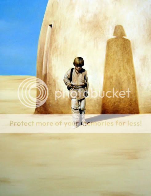
Star Wars Finished
Unless another commission comes my way requesting otherwise, I think that it is pretty safe to say that my first and only Star Wars painting is on it's way out of the studio and to it's new home as soon as the paint is dry enough to varnish. I enjoyed working on this piece: the texture in the building, detail in the boy, experience (always a bonus/reward with every next painting). Enjoy it friends.

-Joshua Grabowski
click on the image to load a high res. pic.
-Joshua Grabowski
Saturday, June 12, 2010
website...coming soon
coming very soon in fact... there is so much work that goes into making a site live and building it from scratch, but mark my words... it will be AWESOME! Thanks to all you trusty readers and followers of my blog in the mean time. I'll be sure to post about it when I have the first edition of the site up and running... then you can tell me all about how great it is, and also about all the kinks and problems that need to be worked out! ;)

Thursday, June 10, 2010
Caucasian Flesh Tone Paint - WASTE
One of the worst colors that most oil paint manufacturing companies offer is premade caucasian flesh tone. Granted this is a nice option when starting out mixing colors, but what colors are you really using? Perhaps the mix is more on the warm side of the color scale and adding the wrong blue might leave you with muddy, dirty colors that are flat and weak. When painting human skin, it is best to mix your own. Don't waste money on the premade stuff, here are the basic pigments found on most palettes that I use while making skin tones:
cad. red light
burnt umber & sienna
ultramarine blue
For light flesh tones, start with flake white adding the yellows and a bit of red, using the burnt browns as shadows and blues to cool the color down if it gets "too warm." Medium tones can start with the yellows, adding white only to the highlights. Dark flesh tones use only the burnt browns, red, and blue. Typically, I try to stay away from any black in my work to keep from flat paintings. The best way to figure out which color mixes work best for you is to actually do it. Yes, oil paint might be expensive, but without trial and error you'll never get any better! Jump in, try it yourself!
-Joshua Grabowski
cad. yellow med.
yellow ochre
flake white (warm white)cad. red light
burnt umber & sienna
ultramarine blue
For light flesh tones, start with flake white adding the yellows and a bit of red, using the burnt browns as shadows and blues to cool the color down if it gets "too warm." Medium tones can start with the yellows, adding white only to the highlights. Dark flesh tones use only the burnt browns, red, and blue. Typically, I try to stay away from any black in my work to keep from flat paintings. The best way to figure out which color mixes work best for you is to actually do it. Yes, oil paint might be expensive, but without trial and error you'll never get any better! Jump in, try it yourself!
-Joshua Grabowski
Sunday, June 6, 2010
Little Skywalker
Here is a detail shot of the progress which I am totally happy with! I may not be a Star Wars buff like some people (see: Star Wars Fan 1, & #2) but working on this piece and a recent episode of Family Guy tributing the series has really got my sci-fi movie viewing desires at an unusual high. Maybe I'll relive the SW experience via Netflix someday, until then take a look at my version of Anakin below:
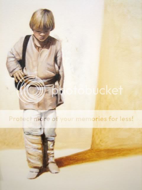
This is just a detail shot of the full painting that I posted a few days ago. The lower half of the boy is needing the most of my attention, but the upper half is coming along nicely! Since this piece was a commission, the client was already excited before I even started it, but now he is literally overjoyed! It's great seeing such a positive reaction to my work. :)
-Joshua Grabowski
Progression - it feels good
I love having my pieces approach completion. Here is a little snapshot of the stage this painting is in currently. Previously I mentioned that I would have this piece completed by today, and even though I didn't meet that self-imposed deadline, I came pretty close. Just a few more sessions of work with this painting and it will be ready for varnish and a frame.
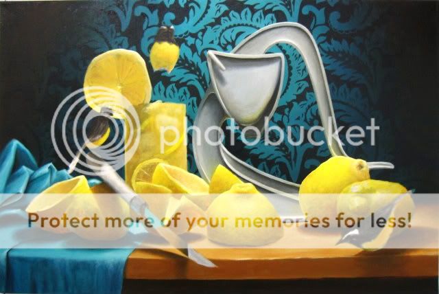
You might think the picture looks the same as it did last time I shared the progress, but the magic is in the detail now. It's only going to get even better! Enjoy!
-Joshua Grabowski
"Lemonade Press" WORK-IN-PROGRESS - 24" x 36" oil on canvas
You might think the picture looks the same as it did last time I shared the progress, but the magic is in the detail now. It's only going to get even better! Enjoy!
-Joshua Grabowski
Saturday, June 5, 2010
Working through the Resistance!
Some days (today included) I just do not want to paint (also note: here I am writing instead of painting), but I'm here next to my easel. I've shown up and that is half the battle. An artist creates art, and if I'm not painting because I just don't feel like it, well, that is no excuse at all! Some fellow artists have recently written to me asking for advice on painting, a golden rule that every painter MUST know. Well, it's not any genius wisdom that I can give out myself but I can borrow the words of a master to pass along a very important thing to keep in mind:
"If you feel as though you can not paint, you should simply paint, and that voice within will be silenced"
-Van Gogh
That sounds simple enough. After I get out the paint, the resistance does just seem to melt away. Here it goes...
"If you feel as though you can not paint, you should simply paint, and that voice within will be silenced"
-Van Gogh
That sounds simple enough. After I get out the paint, the resistance does just seem to melt away. Here it goes...
Thursday, June 3, 2010
Little Anakin & Shadowy Darth
A couple postings back I mentioned that I was working on something with blue skies and sand huts, now progress of that work:
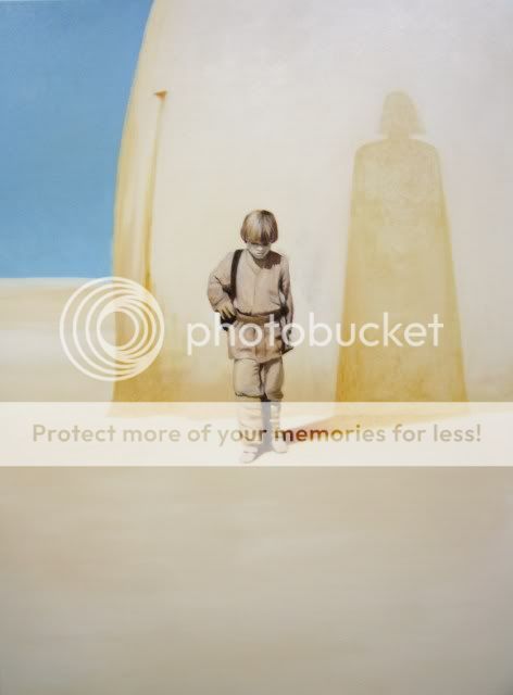
This is a larger rendition (36" x 48") of an existing photo (10" x 15") from a Star Wars calendar. A few questions about making a painting, a couple conversation to discuss details, and a large amount of naples yellow later I am happy with where this piece stands. There is more detail work and a final varnish of this piece left to go, however, this photo gives you the basic general idea of what this will look like in it's final stage - just a little more texture and darkening in the sand & shadow, detail and a tad more color in the boy (Anakin), and I also plan to brighten the sky a little bit as well. Thanks to the wonders of commission work me and Anakin Skywalker are now acquainted on an artistic basis, otherwise I would have never touched a Star Wars piece... "the force Luke, use the force!"
-Joshua Grabowski
Subscribe to:
Posts (Atom)

